Background
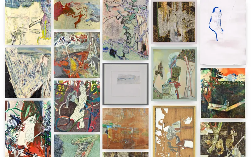
My father, Daisuke Minowa, is a painter. His original website was on Wix, which cost over a hundred pounds a year. I rebuilt it from scratch to save him money and improve the design.
Highlights
Content managed by a non-technical user
Strapi runs as the CMS backend. My father has a least-privilege account scoped to just the content he needs to manage. He was shown how to use it once and has managed the content independently since. The frontend is statically generated: when he uploads new content, he lets me know to trigger a redeploy, which pulls the latest data from the backend at build time. Although I still have to redeploy the frontend, this is far easier than managing the content myself.
Cost optimisation
The replacement costs nothing to run: the site stays comfortably within the free tiers of both Vercel and Strapi Cloud, down from the hundred pounds a year my father was paying for Wix. It is a modest saving, but a real one.
Image optimisation
For a painter’s portfolio, image performance matters. I made use of Next.js’s built-in image optimisation, which handled it with minimal configuration.
Designing for the likely user
My father shows his work at exhibitions. I assumed that people who encounter his work there and look him up would most likely do so on a mobile device. I pictured someone in a gallery, an exhibition pamphlet in one hand, phone in the other, and designed the site to be something you could use comfortably in that situation.
The site is a single scrollable page with no routing or pagination, putting the art first, with a swipe carousel for browsing individual pieces. The navigation is built around that same scrolling motion. It is visible when you land but hides as you scroll down so the art can fill the screen. When you want to navigate, I assumed the natural instinct would be to scroll back up toward where you first saw the navigation, so that is exactly when it pops back in from the top.
Accessibility
I spent a lot of time thinking about accessibility as a design problem, not just a coding one.
I paid particular attention to how content is read aloud by screen readers, which behave differently from a visual browser in non-obvious ways. Em dashes are read literally as ‘dash’ and dates can be announced as bare numbers, so both needed a custom approach to read naturally.
Physical reach mattered too. The carousel’s navigation buttons are grouped close together at the bottom rather than split to the left and right, so on desktop you can move back and forth without dragging the mouse across the screen each time.
I also experimented with using CSS to alter the visual layout while preserving HTML semantics: in the About section I wanted dates displayed above their titles for visual balance, but a screen reader announcing a date before the thing it relates to would have been jarring, so I used flex direction to reverse the visual order without touching the underlying HTML.
Transition animations for state changes
State changes are communicated through simple, quick transition animations rather than elements popping in and out. Abrupt changes can be disorienting, so I took extra care to keep them smooth without being distracting.
Reflections and Learnings
The cost of explanation
Building for a non-technical user made it clear that things a developer takes for granted are not always obvious to others. I found it somewhat difficult to explain to my father that Strapi and the website were separate systems, and that uploading content in Strapi would not automatically refresh the live site. He got used to it quickly, but it got me thinking: the cost of explaining how a system works is itself worth factoring in when designing for non-technical users.
Animation changes how you structure HTML
I was used to showing and hiding elements by inserting and removing them from the DOM, but adding animations forces you to rethink that approach. Removing a node cuts the animation off before it can play, so exit animations never run. The better approach is to keep elements in the DOM and use animation to control their visibility instead. I now try to keep any markup I write as static as possible, so that if I ever do need to add animations later, it is much easier.
Accessibility is not a checklist
Doing accessibility well is more of a mindset than a matter of adding a bunch of specialised HTML tags and ARIA. Writing the code well is important, but actually thinking about how people will interact with the site can lead to discoveries where semantics and ARIA alone are not enough.
Headless CMS can save a huge amount of time
I had originally assumed I would need to build out my own custom backend to manage the content, so I was relieved when I found Strapi, a headless CMS that does so much out of the box with minimal configuration. Working mostly by finding the right plugin rather than wiring things up manually felt strange at first, but it was easy to learn for the power it offers. Automatically generating TypeScript types from the schemas was a personal highlight.
CSS always takes the longest
The site itself is simple, but for a portfolio I feel it is important for the design to feel personal, so I did not just want to reach for a component library. It meant most of the time went into writing CSS and getting animations to work correctly, which is great for learning but an enormous amount of effort.